A big chunk of my career so far has been in Product Analytics 🤓 This is a type of quantitative data analysis, where one uses large volumes of user data to assess the navigability and usability of a website or app, to inform Product teams as they try to figure out what to develop next, and later to assess the success of released features and changes.
The problem with quantitative analysis is that you need a lot of traffic for it to make sense. prepped.to, a website I launched a little over a month ago, now has an average couple of dozen sessions a day, greatly depending on whether or not I posted on social that day. From this scant data I can learn, for example, that about two thirds of the users are on mobile. If I try to start figuring out more complex questions, such as the drop-off rate on a certain page, I’m starting to look at nonsensical data, because as I slice and dice, I am left with single-digit user counts.
At this stage of a product’s journey (and really, at any stage), it’s a good idea to remember that you can learn a lot by looking at a couple of users as they use your product. The amount of information you can get out of 3 user tests is incredible. At the moment, however, I am still not sure how to reward test users, and I’d rather not ask my marginalized community for free labor. Instead, I turn to session recordings, provided for free by Microsoft Clarity (who, unfortunately, aren’t paying me for this post). It’s an add-on that’s pretty easy to implement to one’s website, and it randomly and anonymously records users’ screenviews, mousetracks and clicks/taps/gestures as they use the website.
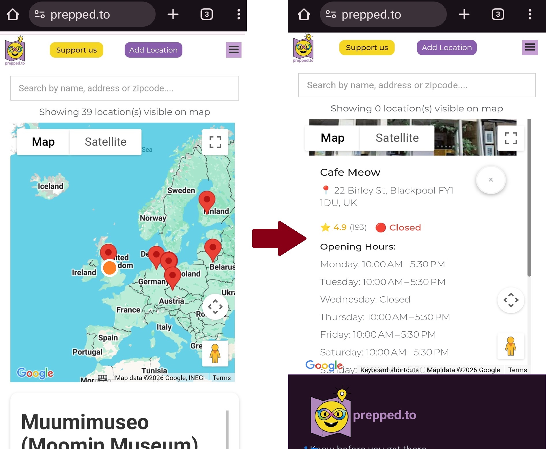
The other day I sat down for all of half an hour and watched these recordings. On our Homepage I noticed that while on desktop, users clicking a map pin see the infoview that opens, scroll down it and click the “See Details” button that will show them the location’s detail page, on mobile users click a dropped pin, see only a Google Maps image of the location, and then repeatedly try to click it, but it isn’t clickable 😠
I realized I urgently needed to improve the UX for mobile users, who as mentioned, constitute ⅔ of all visitors. With the aid of DeepSeek (also sadly not paying me for this post) I improved the map script, and now, when users interact with the map:
🔎 Upon zooming, the location list gets filtered by the shown area
📍 Clicking a pin on the map opens the infoview focused on location name and address with clear scrollbars
👆 Clicking the infoview on mobile, the location detail page opens
✖️ There is a close button in the infoview, so they can close this location and look at another.
It still isn’t perfect. The design looks rather dated, and the infoview always opens above the pin, recentering the map and changing the area visible and location list when users close the infoview. I couldn’t get DeepSeek to fix these in any useful way. I guess that’s as good as this map gets for now, considering that I’m not a JS programmer.
Now it’s time to tell you this little tale, sit back and wait for some new session recordings, and see if users are now having an easier time finding what they are looking for.
Dr. Gal Schkolnik
Aut2Aut CEO & Founder
P.S. Please note that I won’t, in fact, be able to deduce anything from traffic driven by this post, because I just told you how to use the UX. However, the point of the exercise is to improve your experience rather than to run a rigorous AB test.